
CASE STUDY
How I Increased Conversions with UX Design
The Challenege
Navigating Users Toward Action
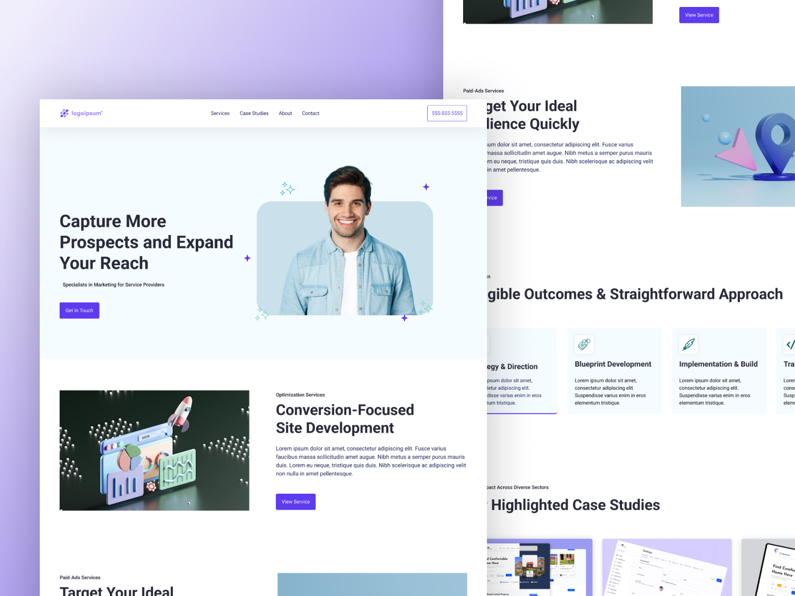
I was tasked with redesigning a homepage that struggled to convert visitors into leads. The digital experience lacked clarity, direction, and emotional connection, especially in a market that can often feel overwhelming to business owners. My goal was to take a user-centered approach and design a homepage that aligned with real motivations and decision-making behavior.
Goals
The Main Objectives
Understand the ideal user’s goals, challenges, and decision-making behavior
Guide users toward action with clear structure and purposeful messaging
Build trust and clarity throughout the entire user journey
My Approach
01. Recognizing What Works in the Industry
I began with a competitor analysis to study how others in the space presented their offerings, paying close attention to layout flow, copy language, and early trust-building elements. I was especially focused on how companies explained jargon-heavy services, aiming to make everything easy to understand for users who might not be familiar with the industry. This helped me identify patterns worth borrowing and opportunities to improve.
02. Understanding the User’s Mindset
I created a proto persona of a busy business owner looking for effective solutions with limited time to research. They are quickly flipping through websites, trying to find something that feels trustworthy and straightforward. Through storyboarding, I mapped their emotional journey from curiosity to hesitation to decision, and used that narrative to shape the flow of the homepage.
A chart proposed by Christina Wodtke has become a go to reference in my user centered design process. It begins with the persona and their goal within a specific context, then moves through the inciting moment, struggles, and crisis, and ends with the changed state. I find this structure especially helpful when sketching the six picture storyboard, as it informs both the overall site flow and the layout of individual pages.
03. Writing for Real People
I rewrote the homepage copy to reflect what users actually care about. Instead of listing features, I focused on outcomes and clarity using benefit driven headlines and language that aligned with real user motivations. I included supportive messaging for users in the early research phase and clear, action oriented copy for those ready to move forward.
Goal:
Create copy that connects with users at different stages of their decision journey and encourages action through clarity and relevance.
Problem:
The original copy was feature heavy and lacked messaging for users still in research mode. User testing revealed that pricing information was hard to find, causing hesitation among potential leads.
Solution:
Rewrote copy to focus on outcomes and user intent. Made messaging more action oriented and informative. Based on feedback, I recommended making pricing more visible to reduce friction and help qualified users move forward confidently.
04. Humanizing the Brand and Guiding Users with Empathy
During the homepage redesign, it became clear that users needed more than information, they needed trust. In a field where skepticism is common due to overpromises and under delivery, building credibility was essential. I implemented a user-centered strategy that emphasized empathy, transparency, and approachable content. These updates not only supported users through their decision-making process but also helped improve conversion readiness. To further build confidence, the page concludes with testimonials and real client success stories.
Key Actions Taken:
Added emotional resonance by including a quote from the founder that acknowledged common frustrations, helping visitors feel seen and understood.
Simplified complex services with clear, jargon-free messaging that focused on user outcomes rather than features.
Introduced a low-pressure CTA inviting users to submit their website for a personalized review, offering immediate value without forcing a decision.
Closed with trust builders like testimonials and case studies to reinforce credibility and showcase results.
The Outcome
Results That Made an Impact
Since the homepage redesign, the site saw a 1,000% increase in organic traffic. Alongside this growth, we observed a noticeable uptick in qualified leads, more users were finding the site organically and booking consultations. While many factors contribute to performance, the improved structure, clarity, and messaging played a key role in attracting and converting the right audience.
Key Takeaways
Know Your Users, Grow Your Business
This project reinforced the value of user-centered design and clear communication. A great homepage is not just about how it looks or how well it ranks. It needs to connect with real users, speak to their goals, and build trust with every interaction. Thoughtful storytelling and strategic UX can turn a single page into a powerful tool for growth.
NDA Disclaimer
This case study outlines my general approach to UX-based design, focusing on aligning user needs with business goals. It does not disclose any confidential internal processes, proprietary information, or actual project documents. The content reflects solely my personal experience and skills, presented from memory without revealing sensitive or protected details.